


Project: End-to-End Responsive Web Design
Project Duration: 80 Hours
Role: UX Designer, Researcher
Design Process: Double Diamond Design Process
Tools: Figma, Sketch, Maze, Optimal Workshop, Zoom
About EnlightenU: EnlightenU is an online platform designed for learning. Ranging from technical courses, business courses, language, arts and more. Designed for anyone, anywhere.
JUMP TO
DISCOVER | DEFINE | DEVELOP | DELIVER | FINAL-DESIGN
I was tasked with creating a responsive web page that focused on learning a new skill. For this project I wanted to learn more about how people learn new skills and why. To begin this project I came up with a couple of research goals and objectives.
PROJECT OVERVIEW
DISCOVER
Research Goals
Research Objectives
Determine how people go about finding a skill to learn.
Understand why people look for skills to learn.
Learn about when people feel is a good time to learn a skill.
Determine the pain points of learning new skills.
We want to know how do people go about finding skills to learn and why they are searching for a new skill to learn. We want to know more about specific services that interest user learning, what are some platforms people use for learning.
I began by creating a competitive analysis chart comparing some of the most popular learning platforms available. Through competitive analysis, I was able to find what sites like Coursera, Masterclass, Udemy and Skillshare had in common, and what were some of the things each one exclusively offered. Ultimately this is an easier way to view strengths and weakness for each platform. This gives us insight on our direct competitors.
COMPETITIVE ANALYSIS
USER INTERVIEWS & INTERVIEW FINDINGS
I recruited based on a small survey I put out on social media and discord. I spoke with anyone who had experience with looking for a skill to learn OR someone who has recently learned a skill/hobby. I gathered 5 participants who all had some previous experience with learning via online. Interviewing them gave me insight directly from people with experience learning skills. I learned about pain points, goals and needs, preferences and more.
I created an Affinity Map to highlight patterns around user goals and needs, pain points, reasons why people learn and more.
AFFINITY MAP
DEFINE
PERSONAS
Personas were then created based on the data obtained in the user interviews.
Keeping both the user and the business in mind, a diagram was created to cross reference user and business individual goals as well as common goals.
PROJECT GOALS
With data gathered from user interviews, competitive analysis and a hybrid card sort, I was able to create a site map of user needs and desired features.
SITEMAP
Based on the two personas created I came up with a user flow for the “Select a Plan” and “Challenge Me” feature. Both displaying user inputs and different path options the user has.
USER FLOW & TASK FLOW
Task flows for Creating an Account, Exploring different courses and the Challenge Me feature were created.
DEVELOP


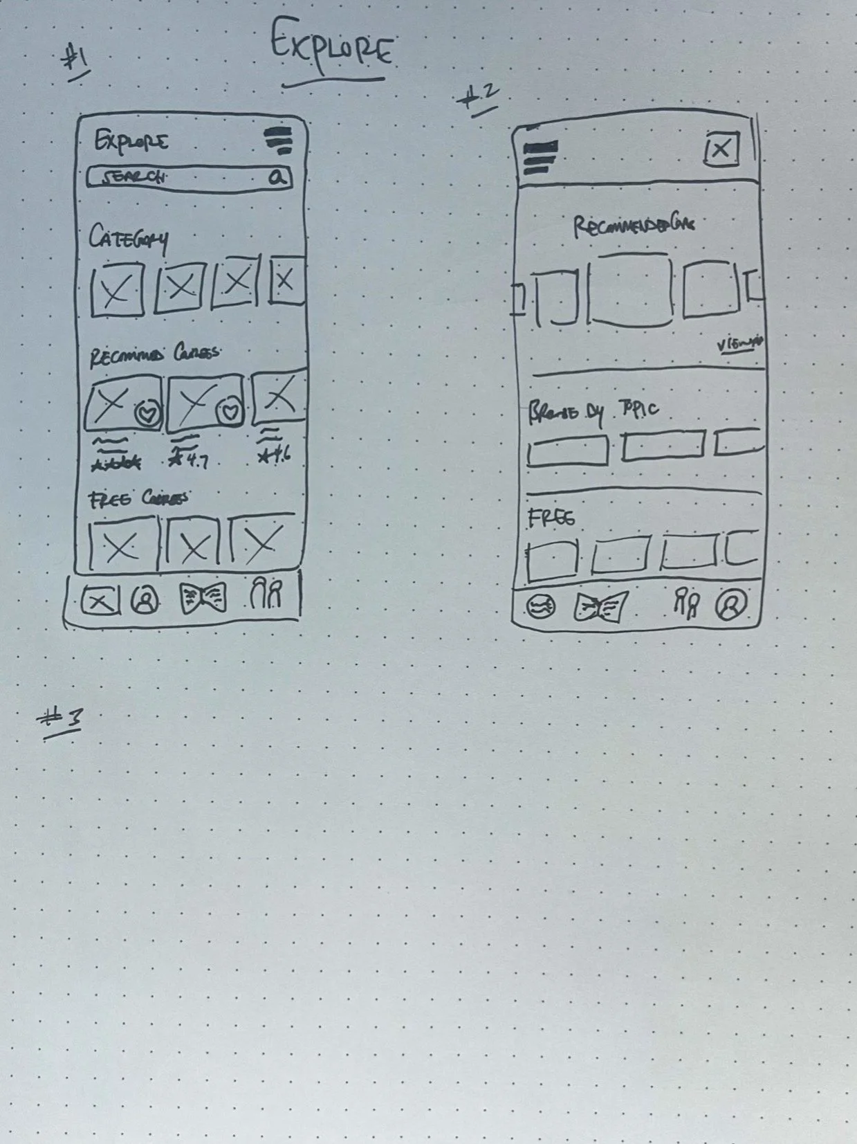
LOW FIDELITY WIREFRAMES
Low fidelity wireframe sketches were created based on user flow and task flow.
After determining which sketches would work best, I took to Figma to create mid fidelity wireframes.
MID FIDELITY WIREFRAMES
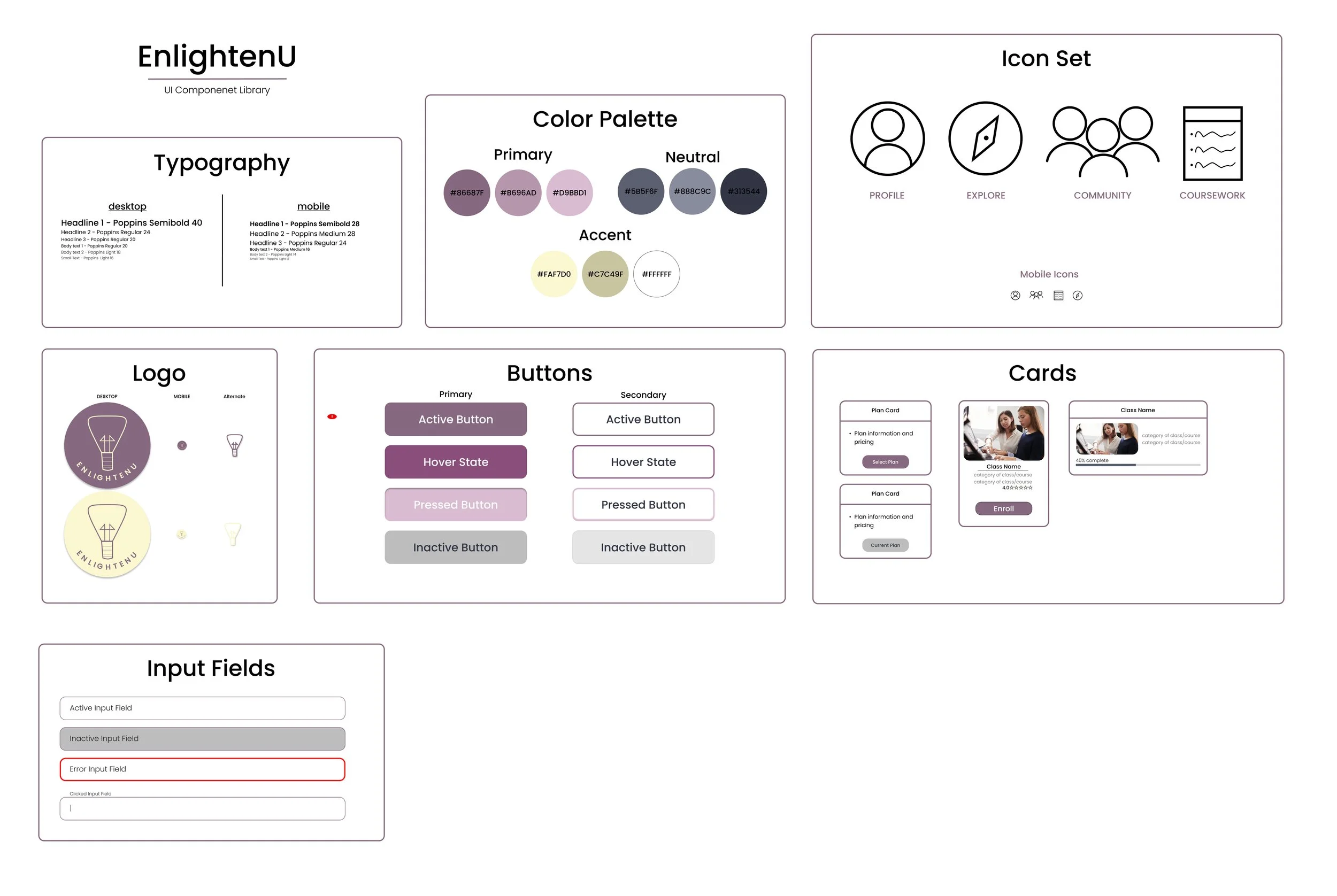
Before designing the high fidelity wireframes, I created the brands identity which include elements that will be used throughout the platform.
UI COMPONENTS
After finalizing the UI Kit, I proceeded to creating the High Fidelity Wireframes.
HIGH FIDELITY WIREFRAMES
DELIVER
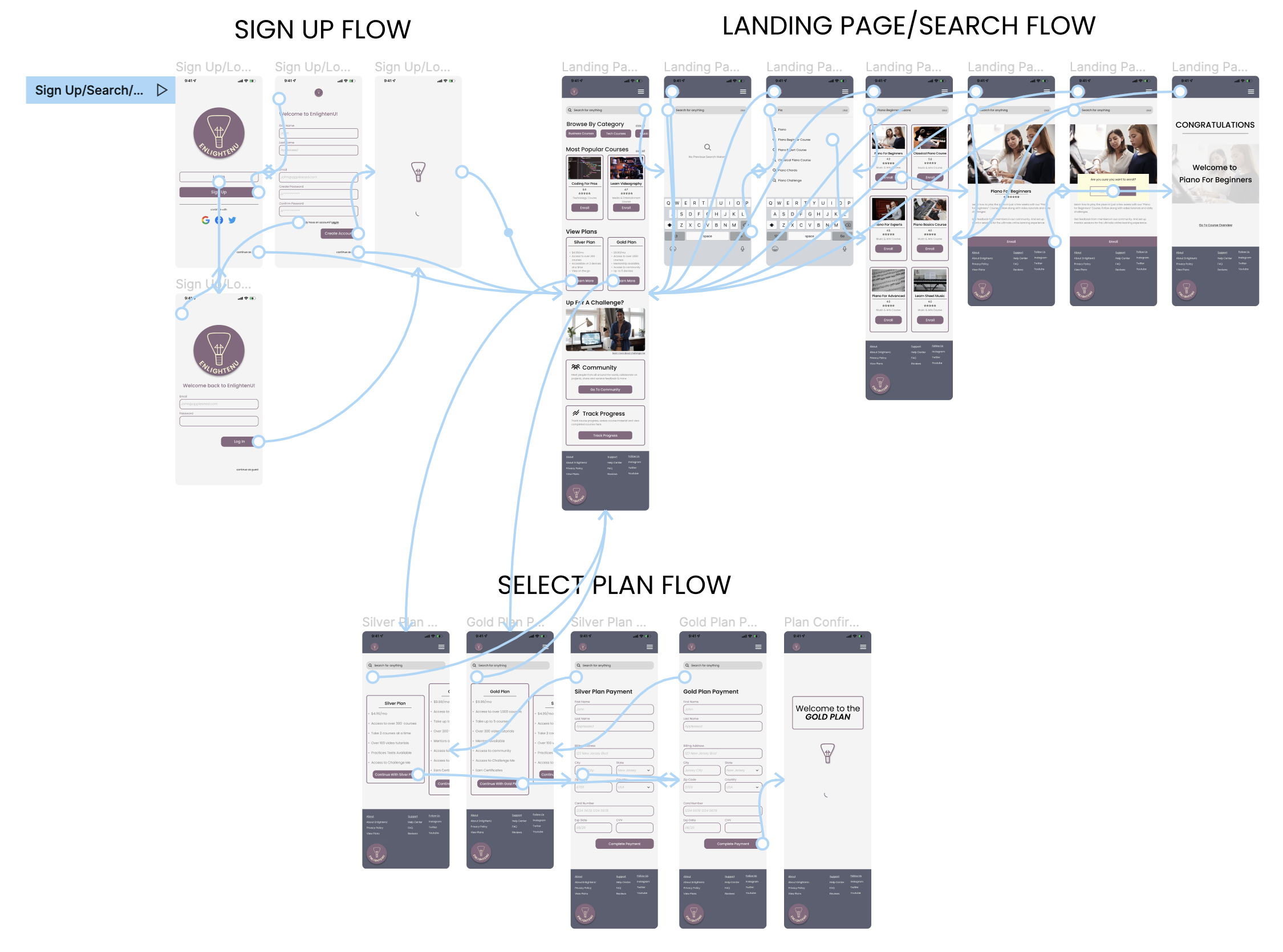
Next I created a prototype for the 3 flows created. (Sign Up/Search/Select a Plan). I used this prototype to test usability with 8 participants. The usability test data allowed me to iterate and make changes based on user feedback and data. For my usability testing I used Maze.
The goals of my usability test were the following;
Get users to complete tasks as soon as possible with little to no error.
Understand what can be improved to make tasks more seamless and usable.
Make sure that users understand the task and how to navigate through the site.
Make sure accessibility needs are met on every screen.
PROTOTYPE & USABILITY TESTING
USABILITY TEST FINDINGS
8 users tested 3 tasks in total. The first was "Creating a new account" Signing up for the Gold plan and searching and enrolling in piano beginner lessons.
For the "create an account" flow 7 of 8 users rated the task a 5 where 5 is extremely easy and 1 is extremely hard.
The selecting the gold plan task was rated a 4.8 of 5 average with 6 of 8 users rating it a 5 and 2 rating it a 4 wIth 5 being extreme easy.
The last task was the biggest challenge for users. The average score was 3.3 only 43% voting 5 (extremely easy).
FINAL DESIGN
NEXT STEPS
If I were to continue working on this project, my next steps would be to
Continue iterating based on data / feedback from usability tests.
Design additional screens and test other tasks/user flows.
Handoff to Developers to make EnlightenU come to life!
This was my first time designing a full product from start to finish, and I learned a lot along the way. I gained skills in conducting user research, market analysis, creating logos, and selecting colors, among other things. Looking back, there were areas where I could have improved, particularly in the initial user research phase. However, with constant feedback and iteration from my peers and mentor, I navigated challenges and delivered the final product.
THANK YOU FOR READING. FEEL FREE TO REACH OUT!